Each image can be shown in full size (640x480) if you click on the small version in this table.
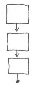 Linear ... one display at a time,
with few options for branching to anything but the next display. Often a
linear structure allows navigation both backward one step and forward one
step. The end of a sequence may exit the program, or loop back to the
beginning. Linear structures are useful for novice computer users, or
basic instruction in a topic where the learners may feel unsure of
themselves. Route navigators may create invisible structures for
themselves -- always taking the "long way" to find a certain web page
because they can remember the path to get there more clearly than they can
its address or domain.
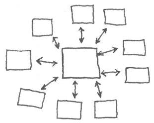 Out/In ... from a central display, each
other one is accessed in one step, and users must return to the central
display in order to get to any of the others. This structure conveys
stability because the users tend to feel as if they are staying still and
having things brought to them - or as if they are only one step away from
"home." Landmark navigators will use more complicated structures in this
way if they can.
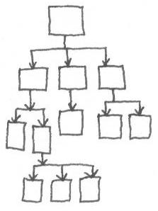 Hierarchy ... this
structure is used often for many kinds of information, and people are
frequently familiar with it. Of course, you still have to make good
decisions about where to place each display so that the relationships in
the hierarchy make sense to the learners! Navigation in a strict
hierarchical structure requires that users return to a higher level before
they can move laterally and make another choice at that level.
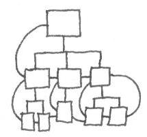 Simultaneous access
... this structure is probably the most common on the web today, or at
least it is the most common basis for structures on the web. It is
essentially a hierarchy in which persistent connections have been provided
between all of the main levels. In a completely simultaneous structure,
one may navigate from anywhere to anywhere, but a large system gets out of
control on this model very quickly since there are potentially so many
links. Therefore most simultaneous systems provide one or more menus of
links to key points in the hierarchy and access becomes a matter of 2-3
steps instead of 10-20.
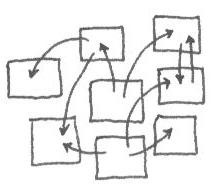
Web ...Displays exist without any relationship to each other except the individual links that may or may not connect them. The popular myth is that this represents the way our brains work, since our brains do seem to be (loosely speaking) undifferentiated matter with electrical connections linking and dividing them into special-purpose segments. Recently, however, most designers with real work to do have concluded that a) we don't know enough about brains to make this claim, and b) if our brains do such a good job with this structure, why do most of us have to use calendars, to do lists, filing systems and other external mechanisms to be able to find information we want when we want it? This structure is interesting and has its place in some kinds of situations, but is not a viable choice for most instructional/informational design situations.
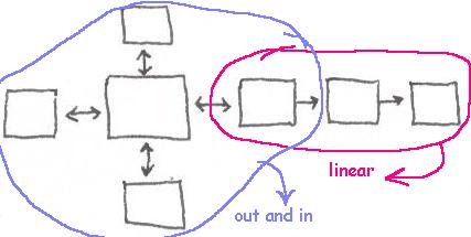 Mixed ... Virtually every structure is
mixed. In a linear product from which you can choose "quit" at any time
the underlying structure is mixed. However, as a designer, you probably
want to think in terms of the predominant structure you're using and
describe your design as having that structure. When you create a mixed
structure, you are usually using one structure for one type or class of
information/activity, and another one for something else -- and you are
probably doing it because it makes the most sense that way. Be sure you
can describe your functional reasons for doing so!
Navigation structures
Navigation is concerned with the connections between the different displays that are available in a hypermedia system or product. Designers can think of the overall arrangement of these connections as forming a structure through which the users of their products are going to be navigating. This need to be an early - and frequent! - part of your design process.
Remember that you will be seeing the "top view," but the people navigating your product will probably not. If you have ever gone into a modern, historic, or reconstructed maze ... sometimes created by planting tall, thick hedges to create winding paths like hallways in a baffling pattern ... you can imagine the feelings of hypertext users who are inside the maze but do not have your "top view" understanding of how the maze is laid out or where they are in it.
Even if you provide people with a map, they want to spend most of their time attending to your content, not to the map. And they may not be able to take as much advantage of the map as you think they should -- translating a linking structure into visual form is an abstract exercise at best, and the users of your product have far less motivation to exert themselves over it than you have. So when you make your map, don't ask yourself whether you have managed to represent your big, complex structure clearly -- ask yourself how you can simplify and standardize that structure so that it needs the least complicated diagram possible to represent it.
The design of your navigation structure is not just a matter of mechanics, but of emotion and interpersonal dialogue.
Rosenfeld, L. and Morville, P. (1998). Information architecture for the world wide web. New York, NY: O'Reilly & Sons. (May get for $12.95 at http://www.indiana.edu/~iirg/ARTICLES/NAVIGATION/www.half.com)
This book concentrates heavily on structural issues for hypertext design. It's a good one to have when you start your first serious design job and people are asking you why you are bothering to spend so much time on "thinking about" the project when clearly you should just sit down and start building something!
Tour guide (linear)
Professor (hierarchy)
Genie (simultaneous access)
Brain (not yours !) (web)
A team (mixed)
Navigation interactions
Each type of navigation structure can also be described in Media Equation terms ... what human role would this structure be playing if it were a person? Sometimes it is easier to ask ourselves whether the role is appropriate than to try and decide if the structure is appropriate.
For example -- if students are supposed to be learning something in-depth, will a tour guide giving a prepared talk in a fixed sequence be the right kind of interaction to support that learning? If your functional specifications include, "Give the learner a sense of exploration and discovery about this topic," do you need a butler or a genie to help that learner along? Maybe the tour guide would be just right presenting the generality in a Reigeluthian concept lesson, but you might need a professor to expound on the complicated connections embedded in a process principle.
| ACTIVITY |
Try conducting a structural analysis after the fact on a web site that you use often. It can be a commercial site, and doesn't have to be a purely instructional one. You are likely to find that the site uses more than one kind of structure, and that's ok. Answer these questions about it:
What is the predominant structure of the site? what human role does that structure correspond to? (It may be one listed here, but you may decide it is something different.)
What are its subordinate structures? When those are used, what is the functional reason for not using the predominant structure?
How well are the structures integrated or connected with each other? Did you notice before this analysis that the navigation structures were different?
If the site has a search function, as many do now, how would you describe that part of the site in terms of structure? (Frankly, my human analog to site searching is often that of sending an 8-year boy and a hound dog out together to find something for you. They stay gone an awfully long time. When they finally do return, one will bring you something nasty and dead from the side of the road, and the other one will be empty-handed, saying, "Well, I didn't really see anything while we were out!"
