Author Archives: Brooke

Push Sign on a Pull Door

Doors. We use them everyday. They are not a very complex tool yet for some reason we can struggle with them. Whenever you struggle to figure out how a door works you typically blame yourself. “This object is so simple I must be an idiot to not know how to use it”. However, doors have amazing cues that tell us how to use them. When these cues are absent we become confused.

Example 1: Push handles

This a well designed push handle door. Just by looking at it you know which side to push on and how it opens. There is no reason for anyone to get confused while using this door.


This is a poorly designed push handle. Yes it makes you want to push, yet there is no indication on which side. When I first used this door I pushed on the wrong side.


Example 2: Pull Handles

This is an example of a well designed pull handle. You want to wrap your hand around the handle which makes you want to pull.


Example 3: Poorly designed doors 

This is a very poorly designed door handle. It is a pull handle that tells you to push. Not only that but the indicitor that tells you to push is difficult to see and read. I can guarantee you that many people have placed their hand over the words ‘push’ and tried to pull the door open.


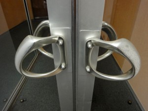
This is another poorly designed door. Both sides have pull handles but we all know that only one side can be pulled. Can you tell which side it is?


The Verdict.

This might be the best door design. You have obvious push and pull handles on each side. There should be no confusion on how this door works.






Don’t Let Poor Design Make you Feel Foolish!

In the book The Design of Everyday Things by Donald A. Norman, one idea that is stressed is how users blame themselves for bad design. We assume that mass produced products are designed properly because we trust companies to put their products through rigorous tests. This truth is that many products are released without any usability testing at all. Companies assume that designers know what they are doing if the product looks nice. However, design isn’t all about aesthetics  If you have trouble using an item don’t blame yourself, blame the design. There is no reason for you to feel stupid because a designer focused more on making an item look nice then making it functional. Function and form can work together to make a product that is easy to use and nice to look at.

Typically when products have too many functions it can become confusing and overwhelming trying to figure out how they all work. So why don’t we have this problem when it comes to the dashboards on cars? Because most of the time car dashboards are designed well. It is important that people do not become confused when driving since it can cause such large risks. If someone can’t figure out how to turn on their defrost and the car windshield is fogging up problems can arise.  It is possible to make an object that may seem confusing not confusing at all.

Take this picture of controls for powered adjustable car seats for example. The buttons are in the shape of what you are controlling and just by looking at it you can figure out how it works. This button layout is an excellent example of natural mapping, affordances and constraints.

So next time you are buying a new product take design into account. Can you figure out how it works by just looking at? Will I make mistakes because the mapping isn’t natural? If a company makes a new product that is difficult to use, by buying that product you are basically telling the company that the design is fine. This is why objects that are poorly designed seem to last for years. Take the CD for example. CD’s are very sensitive and need a case in order to keep it safe, which is also poorly designed. Where just a few years back we had floppy disks that were very well designed. There was only one way to put it in and the part that was sensitive to touch was protected by a plastic covering that was pulled back when inserted into a computer. Yet floppy disks left as fast as they came and it seems as though CD are around to stay.

Don’t assume designers know everything. The objects they build are for you, the user, therefore you should know how to use them without any difficulty.


Don’t Let Poor Design Make you Feel Foolish!

In the book The Design of Everyday Things by Donald A. Norman, one idea that is stressed is how users blame themselves for bad design. We assume that mass produced products are designed properly because we trust companies to put their products through rigorous tests. This truth is that many products are released without any usability testing at all. Companies assume that designers know what they are doing if the product looks nice. However, design isn’t all about aesthetics  If you have trouble using an item don’t blame yourself, blame the design. There is no reason for you to feel stupid because a designer focused more on making an item look nice then making it functional. Function and form can work together to make a product that is easy to use and nice to look at.

Typically when products have too many functions it can become confusing and overwhelming trying to figure out how they all work. So why don’t we have this problem when it comes to the dashboards on cars? Dashboards have tons of buttons that do many different things but somehow we are able to hit the right button even while driving. This is because most of the time car dashboards are designed well. It is important that people do not become confused when driving since it can cause such large risks. If someone can’t figure out how to turn on their defrost and the car windshield is fogging up problems can arise.  It is possible to make an object that may seem confusing not confusing at all.

Take this picture of controls for powered adjustable car seats for example. The buttons are in the shape of a seat so just by looking at it you can see how one button would move the head rest while another would move the seat itself. This button layout is an excellent example of natural mapping, affordances and constraints.

So next time you are buying a new product take design into account. Can you figure out how it works by just looking at? Will I make mistakes because the mapping isn’t natural? If a company makes a new product that is difficult to use, by buying that product you are basically telling the company that the design is fine. This is why objects that are poorly designed seem to last for years. Take the CD for example. CD’s are very sensitive and need a case in order to keep it safe, even the case itself is poorly designed. Where just a few years back we had floppy disks that were very well designed. There was only one way to put it in and the part that was sensitive to touch was protected by a plastic covering that was pulled back when inserted into a computer. Yet floppy disks left as fast as they came and it seems as though CD are around to stay.

Don’t assume designers know everything. The objects they build are for you, the user, therefore you should know how to use them without any difficulty. If you fail in understanding how an object works, especially if it appears simple, than the designer failed, not you.