Author Archives: Brooke

Don’t Let Poor Design Make you Feel Foolish!

In the book The Design of Everyday Things by Donald A. Norman, one idea that is stressed is how users blame themselves for bad design. We assume that mass produced products are designed properly because we trust companies to put their products through rigorous tests. This truth is that many products are released without any usability testing at all. Companies assume that designers know what they are doing if the product looks nice. However, design isn’t all about aesthetics  If you have trouble using an item don’t blame yourself, blame the design. There is no reason for you to feel stupid because a designer focused more on making an item look nice then making it functional. Function and form can work together to make a product that is easy to use and nice to look at.

Typically when products have too many functions it can become confusing and overwhelming trying to figure out how they all work. So why don’t we have this problem when it comes to the dashboards on cars? Because most of the time car dashboards are designed well. It is important that people do not become confused when driving since it can cause such large risks. If someone can’t figure out how to turn on their defrost and the car windshield is fogging up problems can arise.  It is possible to make an object that may seem confusing not confusing at all.

Take this picture of controls for powered adjustable car seats for example. The buttons are in the shape of what you are controlling and just by looking at it you can figure out how it works. This button layout is an excellent example of natural mapping, affordances and constraints.

So next time you are buying a new product take design into account. Can you figure out how it works by just looking at? Will I make mistakes because the mapping isn’t natural? If a company makes a new product that is difficult to use, by buying that product you are basically telling the company that the design is fine. This is why objects that are poorly designed seem to last for years. Take the CD for example. CD’s are very sensitive and need a case in order to keep it safe, which is also poorly designed. Where just a few years back we had floppy disks that were very well designed. There was only one way to put it in and the part that was sensitive to touch was protected by a plastic covering that was pulled back when inserted into a computer. Yet floppy disks left as fast as they came and it seems as though CD are around to stay.

Don’t assume designers know everything. The objects they build are for you, the user, therefore you should know how to use them without any difficulty.

 

The Design of Everyday Things

So this week I finished the book The Design of Everyday Things by Donald A. Norman.

I learned a lot about basic design in this book. Some of the highlights include;

  • Natural Mapping
  • Constraints and Affordances
  • Mental Models
  • Feedback and Visibility

Bad Design

Good Design

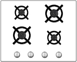
The picture above shows how a design with natural mapping should look. You know how to use the stove by just looking at it.

The Design of Everyday Things

So this week I finished the book The Design of Everyday Things by Donald A. Norman.

I learned a lot about basic design in this book. Some of the highlights include;

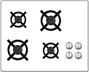
  • Natural Mapping:  This is a very important part of design. Natural mapping has to do with how the layout of the controls are arranged when working with an object that requires controls. If an object has good natural mapping than a person should be able to use it by just looking at it. An example of this is below with the stove top.
  • Constraints and Affordances: This is has to do with how many things an object can do. For example, when you look at a coffee mug handle there are very few ways to hold it. It is designed in such a way that you want to hold it with one hand because that is all that is physically possible. When an object contains affordances it makes it easier for people to use because there are less ways for them to mess up.
  • Feedback and Visibility: This is how an object tells a person that what they just manipulated did something. So when you turn the tv on and you can see the little light in the corner turn from red to green. This means that you pressing the button did something and everything is running smoothly. Computers are notorious for having very little feedback. This is because so much is happening behind the scenes it it very difficult to show users what is happening. So when you click on something and nothing happens, the little progress wheel doesn’t pop up, you automatically assume that you failed in clicking. It is important to have feedback or else users assume that either they are doing something wrong or that the item is broken.

Bad Design

Good Design

The picture above shows how a design with natural mapping should look. You know how to use the stove by just looking at it.

The Design of Everyday Things

So this week I finished the book The Design of Everyday Things by Donald A. Norman.

I learned a lot about basic design in this book. Some of the highlights include;

  • Natural Mapping
  • Constraints and Affordances
  • Mental Models
  • Feedback and Visibility

Bad Design

Good Design

The picture above shows how a design with natural mapping should look. You know how to use the stove by just looking at it.

The Design of Everyday Things

So this week I finished the book The Design of Everyday Things by Donald A. Norman.

I learned a lot about basic design in this book. Some of the highlights include;

  • Natural Mapping
  • Constraints and Affordances
  • Mental Models
  • Feedback and Visibility

Bad Design

Good Design

The picture above shows how a design with natural mapping should look. You know how to use the stove by just looking at it.