Author Archives: Stephanie Kozick

construction no. 1


Yoshimoto’s Kitchen

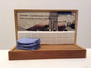
The words that inspired this project’s first model construction to represent text are from Banana Yoshimoto’s book, Kitchen (1988):

The place I like best in the world is the kitchen. No  matter where it is, no matter what kind, if it’s a kitchen, if it’s a place where they make food, it’s fine with me.  Ideally it should be well broken in.  Lots of tea towels, dry and immaculate.  White tile catching the light (ting! ting!) (3).

The most captivating aspect in pre-production was the anticipation of sewing up tiny tea towels.  I went to Canvas Works in downtown Olympia (http://canvasworks.net/) to find pure linen.  The owner led me to the bolts of linen; I sheepishly disclosed that I was making an art project that required tiny linen towels (I presupposed from Yoshimoto’s text that the fabric of the tea towels was linen, and in fact, when I visualized the text saw the word “linen” associated with towels even though that precise word does not appear).  The owner was surprisingly interested and became fully involved in helping me select the exact linen weight and color.  Sewing the tea towels was the last step in the production of the piece.  The first step involved inventorying the wooden boxes that I own.  A cedar box made its way into my hands and I suddenly pictured how it could be re-fashioned to resemble a kitchen counter space and backsplash.  In between those first and last steps I made my way to ReStore (http://www.spshabitat.org/restore/) to pick out white tile—as in “White tile catching the light…”  Their inventory of tile was not as great as I remembered it to be, but I found a small box of assorted white tiles and chose two styles—my bag of about 40 tiles came to $1.60. 

Next, I assembled all the parts, not making the mistake of gluing at that point.  I cut the bottom of the cedar box in two with a Dremel jigsaw to form a “counter,” then sized things up to figure out where the text might go.  I spent a good deal of time with an alphabet rolling stamp (http://img0.etsystatic.com/000/0/6261595/il_570xN.269250752.jpg), but this proved to be too inaccurate and annoying, so I switched to computer generated printing.  Selecting the paper also proved to be time consuming, trying out different kinds of paper and fonts.  An image from a Japanese calendar coordinated with the white tiles best and gave a nod to Yoshimoto’s heritage. 

Glue the tiles—wait—grout the tiles (which proved to be very tedious and messy)—wait—glue the image with text—wait—glue the shelf—wait, tape the little pile of towels onto the counter—done.  


Everybody lives somewhere

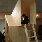
The White Tower by Worapong ManupipatpongWhether one has a structure with four walls and all the amenities that go with one’s interpretation of the “good life,” or an open itinerant version of “home,” it all amounts to living somewhere, and we can picture that place in our minds.

The White Tower by Worapong Manupipatpong