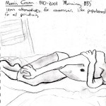
Last week’s visit to the Seattle Art Museum was enlightening, inspiring and informative to the approach in portraiture that I’m going for. After a day of profuse sketching and wandering, I couldn’t wait to run home and start drawing people. While gazing at some paintings by 20th century Spanish-American artist, Morris Graves, especially “Morning” 1933, my questions on the line between realism and expressionism were answered; getting the right body proportion is key. Pictured bellow are “Morning”, and some of my sketchbook studies (my solution to forgetting to bring a digital camera)

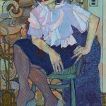
As I’ve had time to contemplate and experiment with portraiture, these past weeks have been all about figuring out correct proportion and skin tone, using myself and friends as quinine pigs. My goal is to get used to adding more and more color to the person, to execute an honest skin color and body proportion that is vibrant and expressive; much like what is shown above: Hope Gangloff’s “Vera”, 2013. Despite the urging of friends and artists for me to start oil painting, I am still going deeper into using chalk pastel as testing grounds for getting skin color down; something that’s important for me to get comfortable with before I graduate on to the medium of oil. In my latest portrait, “The Jamie” I’ve implored the use of some vivid, surreal colors, while also trying to stay true to the shadows I perceive. In terms of expression, I wanted to emulate the sense of natural comfort in his body language, the contemplative look on his face, the cool atmosphere of light cast by the bluish wall in the background. For a full-scale look at my drawings, go to the ‘Images’ tab above
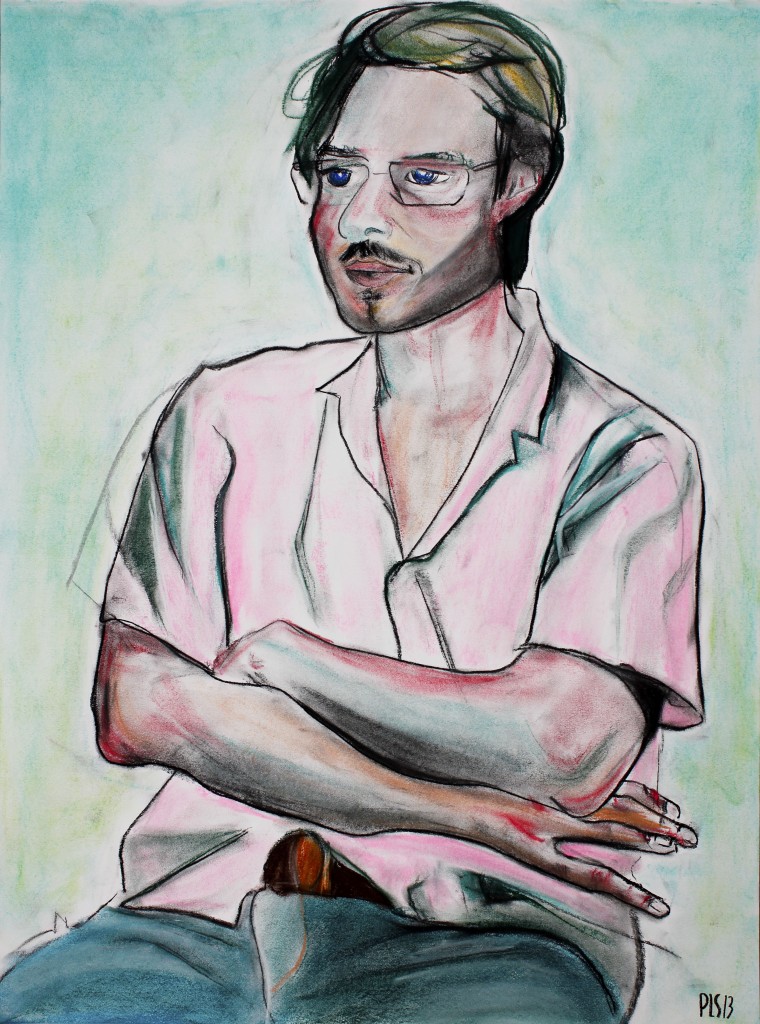
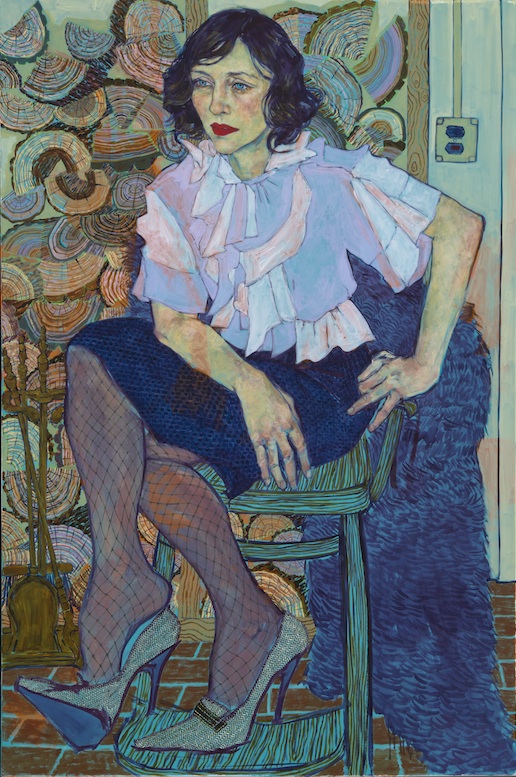
Hope Gangloff “Vera” 2013