Hello,
I realized I haven’t made a post in a while, so I figured that I would put forth hard information on the color correction techniques I’m using and why they are important to creating a certain look and feel.
I feel like every film has had some type of post production editing done to the image quality — at least from the 80′s on they must have realized the beautifully startling effect just a little bit of tweaking could have.
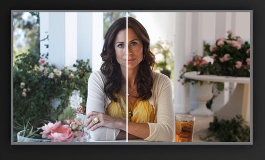
The process is very similar to what a photographer would encounter when editing their photos in post, given that you’re literally just trying to improve the image quality in some way from the original. The tools used for editing in both video and photo allow the artist to have complete creative control over the image style.
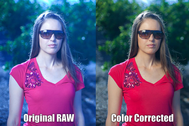
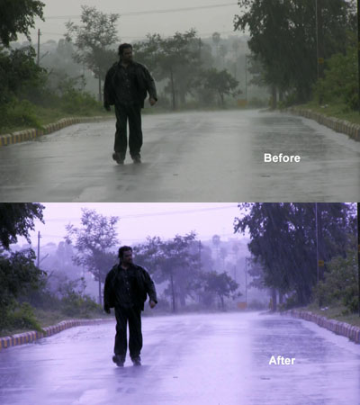
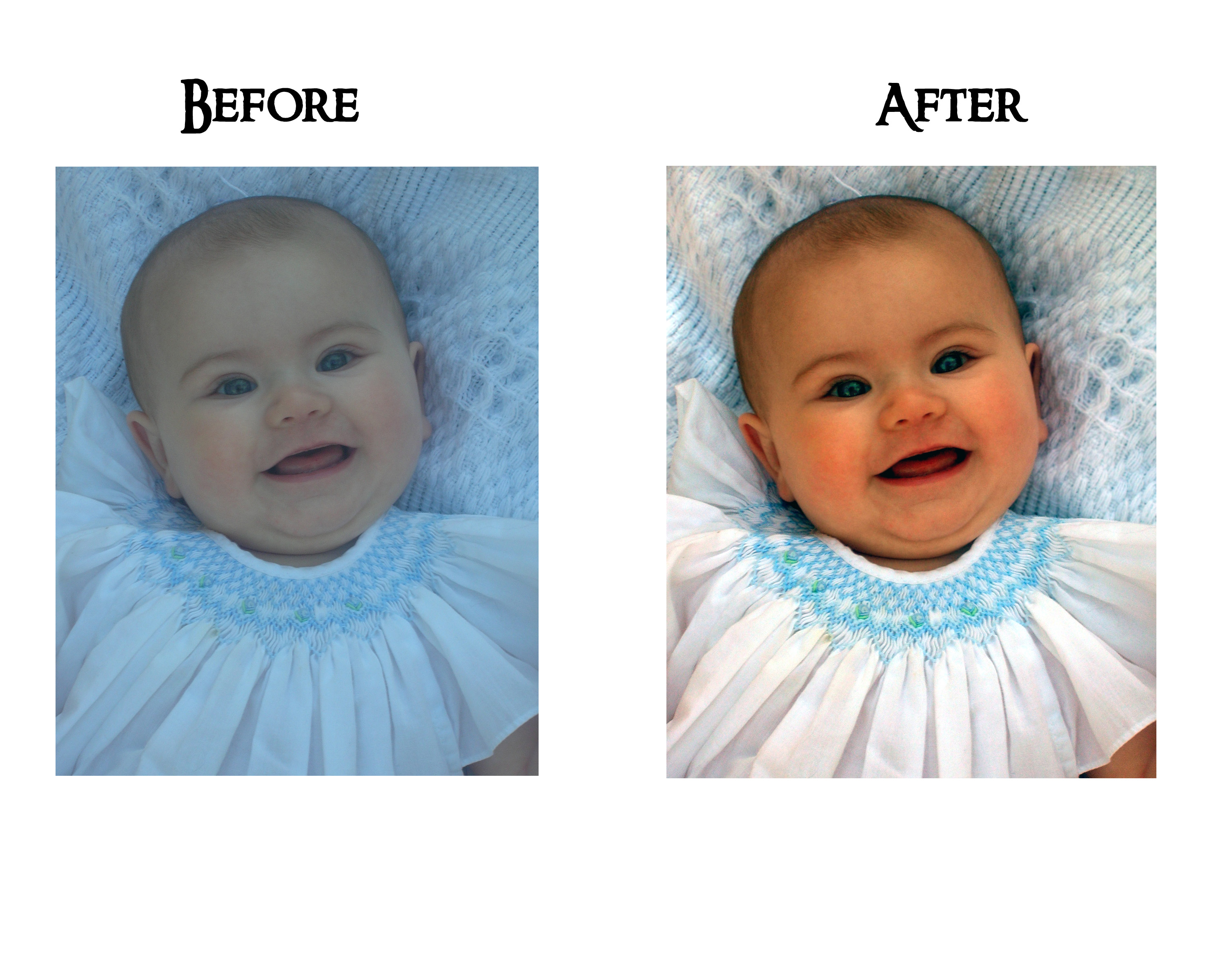
As you can see in comparison, they lightened up the image, corrected the color on both the subject as well as the background and I’m sure they adjusted the contrast/levels to make the image more neutral in density.
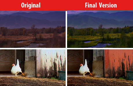
Having complete creative control over the presented image means that you don’t have to stick with any certain look or feel. The programs I’m using to edit make it really easy to revert my changes and is powerful enough to change literally every aspect that I could want to about the image. Using the last image as an example, the barn door adjacent to the chicken didn’t seem right as a plain white.. the image looks more full – a little more intense and heavy. It gives the picture some weight, and if the emotions are high in the particular scene then I’m sure the two would translate well together on screen.
This is probably my favorite part of the process as I’m always trying to get the best possible image out of my cameras/I always have a certain look in mind when I start a film project. After every shoot, if I have time, I sit down with the footage, color correct most all of it and then decide on which specific shots to use after I have the completed footage.
I’m not sure if it’s the most efficient way to do what I need however having this kind of control intrigues me and, as I said, I enjoy spending my time on this part of the film making process. This activity only reaffirms my aspirations as a cinematographer of some sort, I’m pretty excited with what I could use this on in this future.