2D Visualization
2D Visualization
While it lacks the depth of three-dimensional visualization, 2D visualization is better suited to certain types of data and forms of publication (e.g., print). This is a list of our two-dimensional work and software projects.
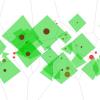 Our Voronoi Diagram stem maps show the neighboring trees, i.e., all neighboring
trees with diameters greater than 5cm at breast height. Live tree boles
are brown, with a green diamond depicting crown radii measured to the
North, East, South, and West. Dead tree boles are shown in red. The
tree of interest's crown diamond is highlighted in blue and its bole is
rectangular rather than circular. Grey lines between trees define areas
closest to the midpoint of the stem of each live tree. This visualization is part of the Tree Catalog.
Our Voronoi Diagram stem maps show the neighboring trees, i.e., all neighboring
trees with diameters greater than 5cm at breast height. Live tree boles
are brown, with a green diamond depicting crown radii measured to the
North, East, South, and West. Dead tree boles are shown in red. The
tree of interest's crown diamond is highlighted in blue and its bole is
rectangular rather than circular. Grey lines between trees define areas
closest to the midpoint of the stem of each live tree. This visualization is part of the Tree Catalog.
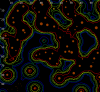 The Simple Root Visualization application visualizes real and modeled
nitrogen uptake data. The data represents a plot on a grid. For each
tree and each grid cell, a value represents how much nitrogen is being
consumed from the cell by that tree. The application uses this data to
produce a variety of visualizations, including color-coded grid cells
(shown) and isolines representing total nitrogen uptake, as well as
color-coded grid cells and isolines for the number of different trees
drawing nitrogen from an area.
The Simple Root Visualization application visualizes real and modeled
nitrogen uptake data. The data represents a plot on a grid. For each
tree and each grid cell, a value represents how much nitrogen is being
consumed from the cell by that tree. The application uses this data to
produce a variety of visualizations, including color-coded grid cells
(shown) and isolines representing total nitrogen uptake, as well as
color-coded grid cells and isolines for the number of different trees
drawing nitrogen from an area.
![]() 2D CanopyView is designed to be a counterpart to our 3D visuzliation software, CanopyView.
It offers a simple graphical interface to end-users, allowing them to
easily generate and export two-dimensional, data-driven visualizations
suitable for print or other forms of distribution.
2D CanopyView is designed to be a counterpart to our 3D visuzliation software, CanopyView.
It offers a simple graphical interface to end-users, allowing them to
easily generate and export two-dimensional, data-driven visualizations
suitable for print or other forms of distribution.
2D CanopyView offers a simple Developer API to allow visualization programmers to easily add additional visualization functionality to the program using Python.